Path of Questions?
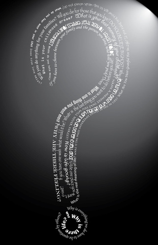
This is my path of questions that I made in Illustrator. For this activity we had to make a question mark with the pen tool than cut it and add texts in it. In this activity, we're required to have variety of questions, font types, font sizes and font weight. Some challenges that I faced in this activity was the the font sizes and types. Sometimes, some of the fonts i picked are too big or the type of font is too huge and bold; so it made everything out of place. Some of my sentences gets cut off. Overall, I think that the outcome was good. I picked a gradient background because every questions we had we need an answer to it. The white bright spot at the left upper corner represent answers to our questions. We get happy when when our question gets answer.
Art Show
Lego-Cop
Moncerrat Avila, Naomi Jones, Xia Her
My artwork is a stop-motion clip created with two other group members. We decided to create a stop-motion clip after viewing other clips. We were interested by the fact that many sequencing images can create a movie. After creating a sample clip, we realized how much work and images would be required to make a detailed clip. We used the Canon Rebel T3i camera to take pictures, and then edited the clip in iMovie. We chose to use Legos as characters because they would facilitate adding human characteristics due to their movable arms, legs, and heads. Getting the Lego characters to convey our clip’s message without sound or captions was difficult, but I believe we did a good job. Our clip’s message is that speaking on the phone while driving is dangerous and can create many problems.
Fall Art Show Poster
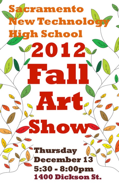
This is the poster that I made for the Fall Art Show of 2012. I used my challenge design from a project in this poster because the design resemble autumn. I used the same fonts for all the letters but just different sizing. The font I used is Rockwell Extra Bold Regular. I chose to have my words in different colors because it fall and there are a lot of colors. The colors that i used are Fall colors. One challenge that I have was choosing the positions and place to put the words and the design. It was hard because some of the words were hard to read since the design is blocking it or it's blending in.
Photographic Alphabet
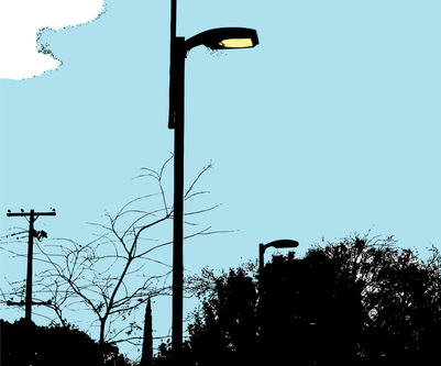
This is my Photographic Alphabet of the letter R. What we had to do in this project is go out and take pictures of objects that form a letter. My letter that i found is R and it's from a street lamp.
Background Replace
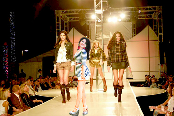
This is my background replacement that i used Photoshop and Illustrator to made. What we had to do is take a picture of someone or yourself and cut them out of the original picture and put them into a new background. The picture and the new background has to blend in and look realistic or like it belong together. Some challenges that i faced are making my picture blend into the background one. The background picture is very bright so i had some difficult time trying to make my picture bright.
Harmon Enterprises Logo and Wordmark
Digital Portrait
Visual Onomatopoeia
Scissor Pen tool
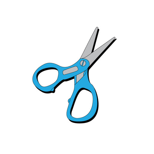
This is a scissor I made using the pen tool in Illustrator base on a image of a scissor. I traced the image with the pen tool and then I color it and add a shadow behind it.
Powerpoint of Threadless design
https://docs.google.com/a/snths.org/presentation/d/1MKqKdeSpqSVIei_9fHdsxBk6h7Dy6KVacF8LK_GAY_I/edit#slide=id.p
Tissue Box
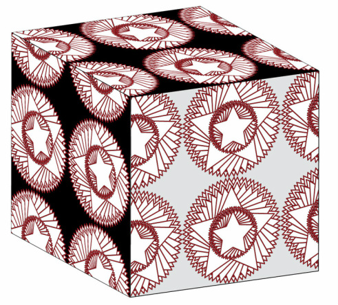
This our Tissue box that me and my partner made in VisCom. We used a star to make our design. We picked this design because it like Captain America's shield. When you have allergies the only thing that could save you is tissues!
Challenge Design
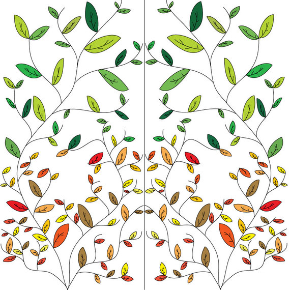
This is me and my partner challenge design. We were challenge to make a door that resembles nature in it. So, we decided to use leaves because it resembles nature. We picked these colors because we want it to be like fall, where the leaves at the top of the tree are still green and the ones on the bottom are brown,orange, and yellow, and there falling.
Partner Patterns
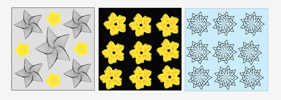
These are the designs that i made with my partner for the Partner Pattern. We just wanted to try different things and to use all the effects that we learned in VisCom. So, we try different shapes and effects on our patterns and these are the three that we like.
Patterns
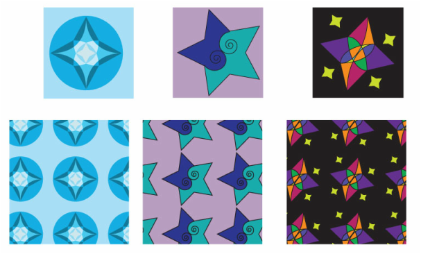
These are three patterns that made in VisCom. These designs have geometric shapes, lines and interactions spaces between it. When the pattern is duplicated it creates a designs or shapes with in the spaces.
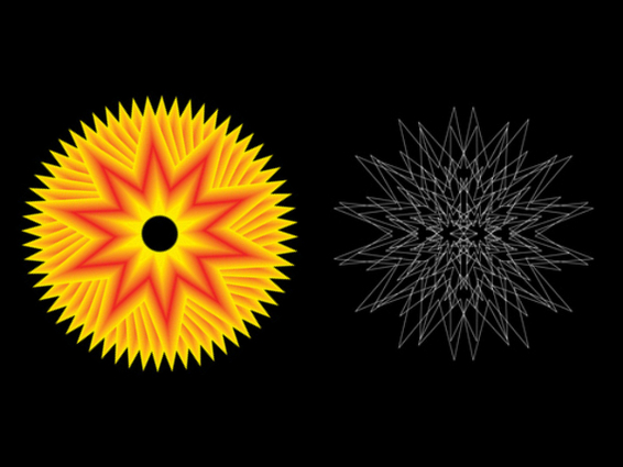
Radial Balance Designs
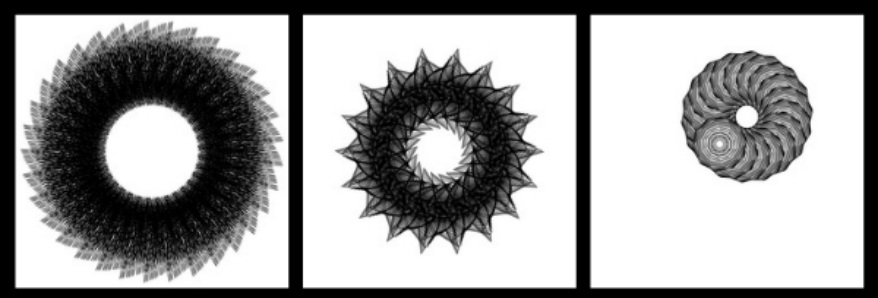
These three designs shows radial balance.
Radial balance is when the shapes or lines that you use radiate outward from the center point in a circular fashion. I create this in my first week of school in Viscom class.
Radial balance is when the shapes or lines that you use radiate outward from the center point in a circular fashion. I create this in my first week of school in Viscom class.
Symmetrical Balance Designs
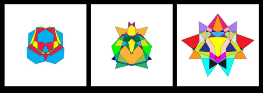
These three design are call symmetrical balance because they reflect on the other side of the design making it has the same design on both side.
Blend /Repetitions
This is my blend/repetition design that created in VisCom. I used some simple shapes to create this and all i did was repeat its shape.
Radial /Symmetrical RFTA Group Designs
This my two design that i created in my RFTA group. We each has to create a radial and symmetrical balance design. I came up with these two designs. The left one is the radial balance and on the right its the symmetrical design. Our common theme in our group design was the color and the background along with the similarity shape.
Partner Design
This is my partner design. We created this from a rectangle and a star shape. We than pucker it and transform it to create this design.
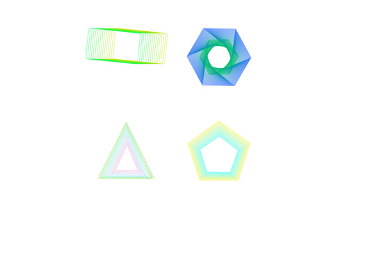
Radial Balance 2 (3 concentric rings)
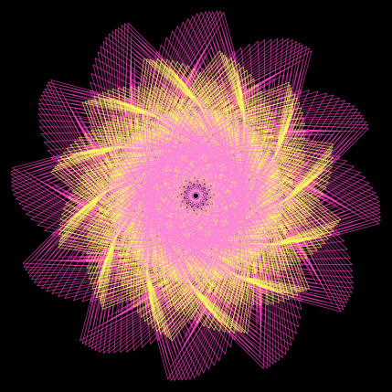
This the radial balance design that has three concentric rings in it. I used similarity shapes to create this. I then transform it and add color to it.
